Product design

HIVE

Hive is a platform that provides key services to employees who suffer from heavy work duties with mental concerns

My Role

Lead UX researcher

UX/ UI designer

Tools

Qualitative methods:

Interview

Focus group / AB testing


Softwares:

Figma


Project timeframe

4 months

Background

Background

Background

Coyote

David

LILI

Olivia

Designer

Designer

UX and tECH

vISUAL

What is “996”

What is “996”

What is “996”

Team

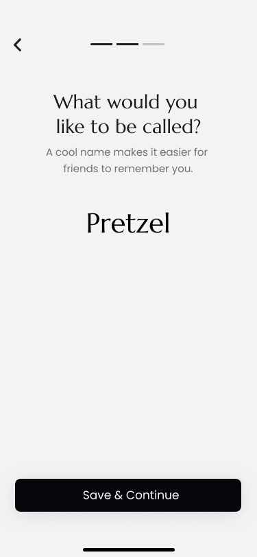
Pretzel

Team

Pretzel

Result of hustle culture + competitive industry,

resulting a negative impact on mental health in our society.

Result of hustle culture + competitive industry,

resulting a negative impact on mental health in our society.

Overwork:9am to 9pm, 6 days a week

Overwork:9am to 9pm, 6 days a week

Design Process

Design Process

Design Process

Step 1: Understand

Learn about the pain points and our audience under the 996 culture.

Step 2 Research

Gather data and form questions based on reliable sources

Step3 : Analyze

Define the issues as the service we will provide


Conduct UX testing based on early-stage wireframes

Step 4: Design

Build solutions based on data and previous conclusions


Conduct a focus group study to log user feedback based on prototypes

Step 5 : Evaluate

Re-evaluate the project and solution based on user feedback


Re-visite the solution proposed

Understand

How might we

Design a digital solution for 996 people that

allows them to relieve their physical and

mental stress in the workplace?

How might we

Design a digital solution for 996 people that

allows them to relieve their physical and

mental stress in the workplace?

How might we

Design a digital solution for 996 people that

allows them to relieve their physical and

mental stress in the workplace?

pain point 1

Lack of Exercise

pain point 2

Lack of Social life

pain point 3

Lack of Help

pain point 1

Lack of Exercise

pain point 2

Lack of Social life

pain point 2

Lack of Social life

pain point 3

Lack of Help

Research-based solutions

Why H!VE?

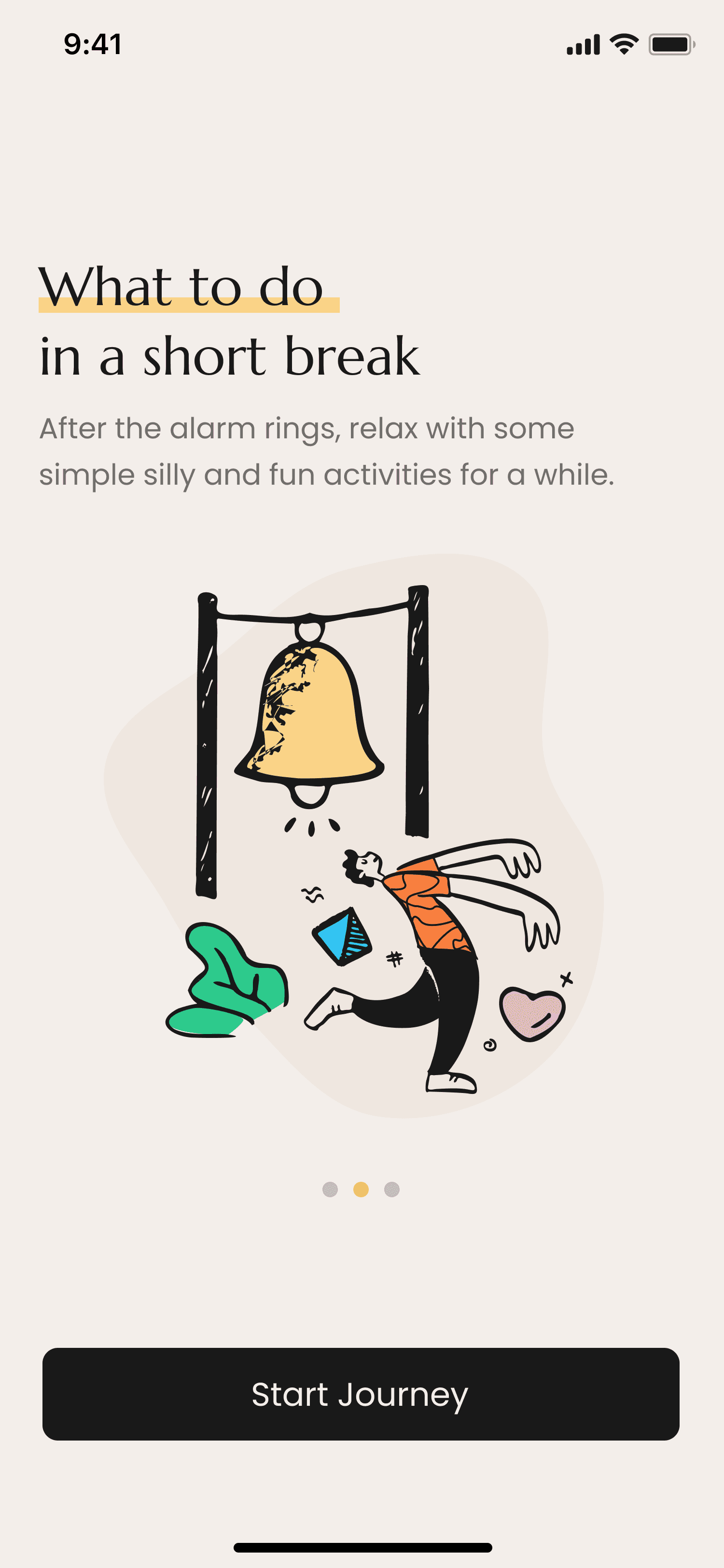
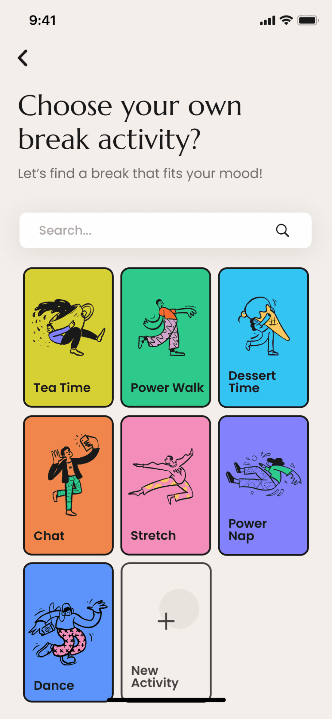
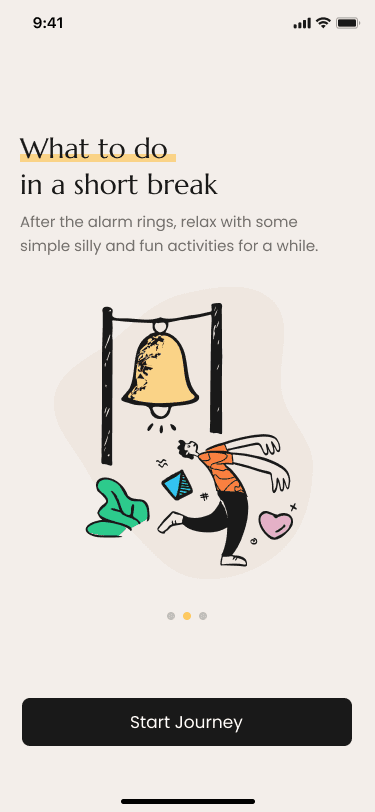
Break reminder & Community

UX Design

Usability heuristics analysis

Analyze

Analyze

To make all the improvements, our process is a continuous loop of design and testing.
A/B Testing

A/B Testing

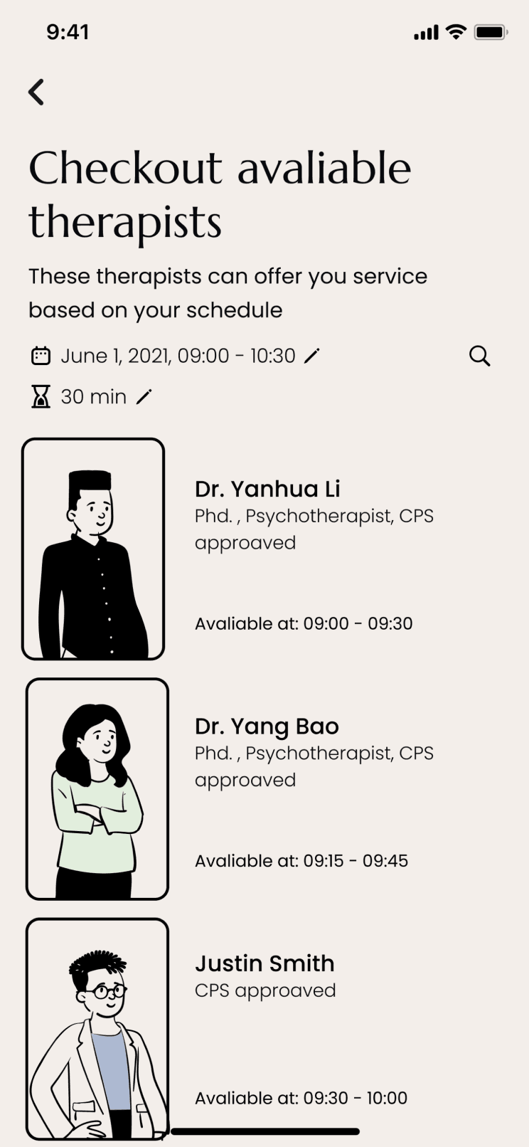
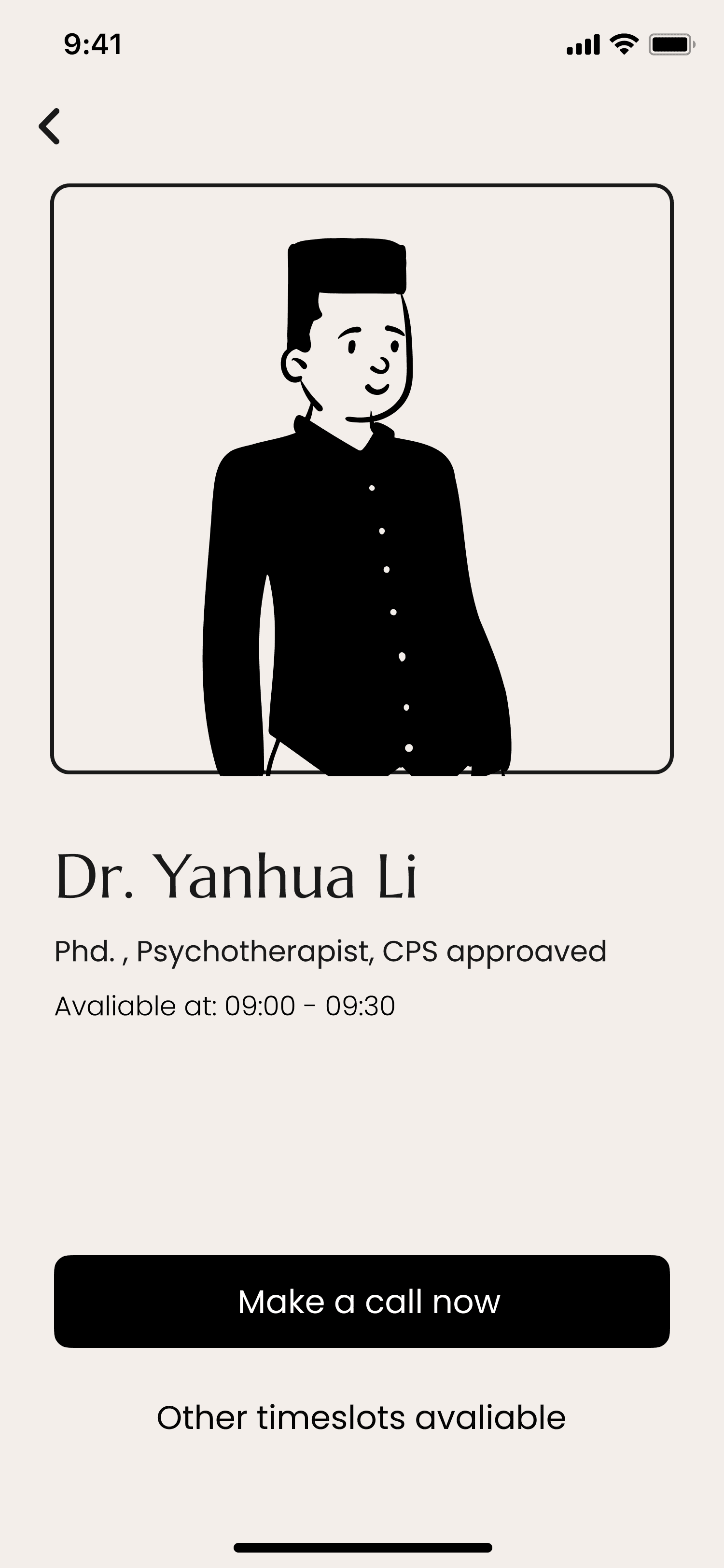
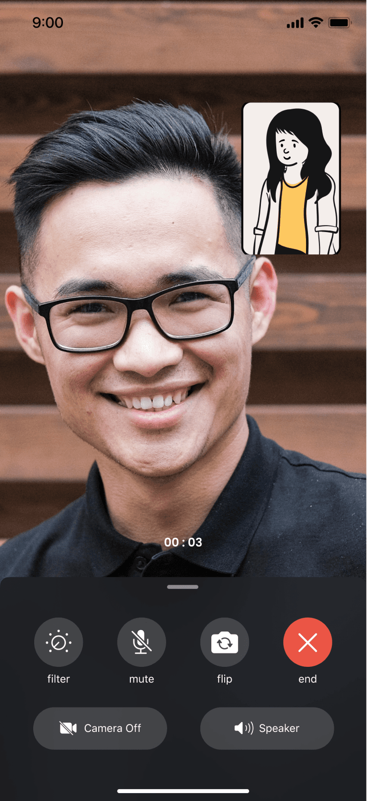
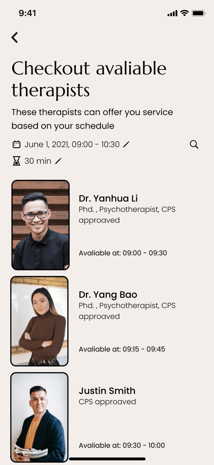
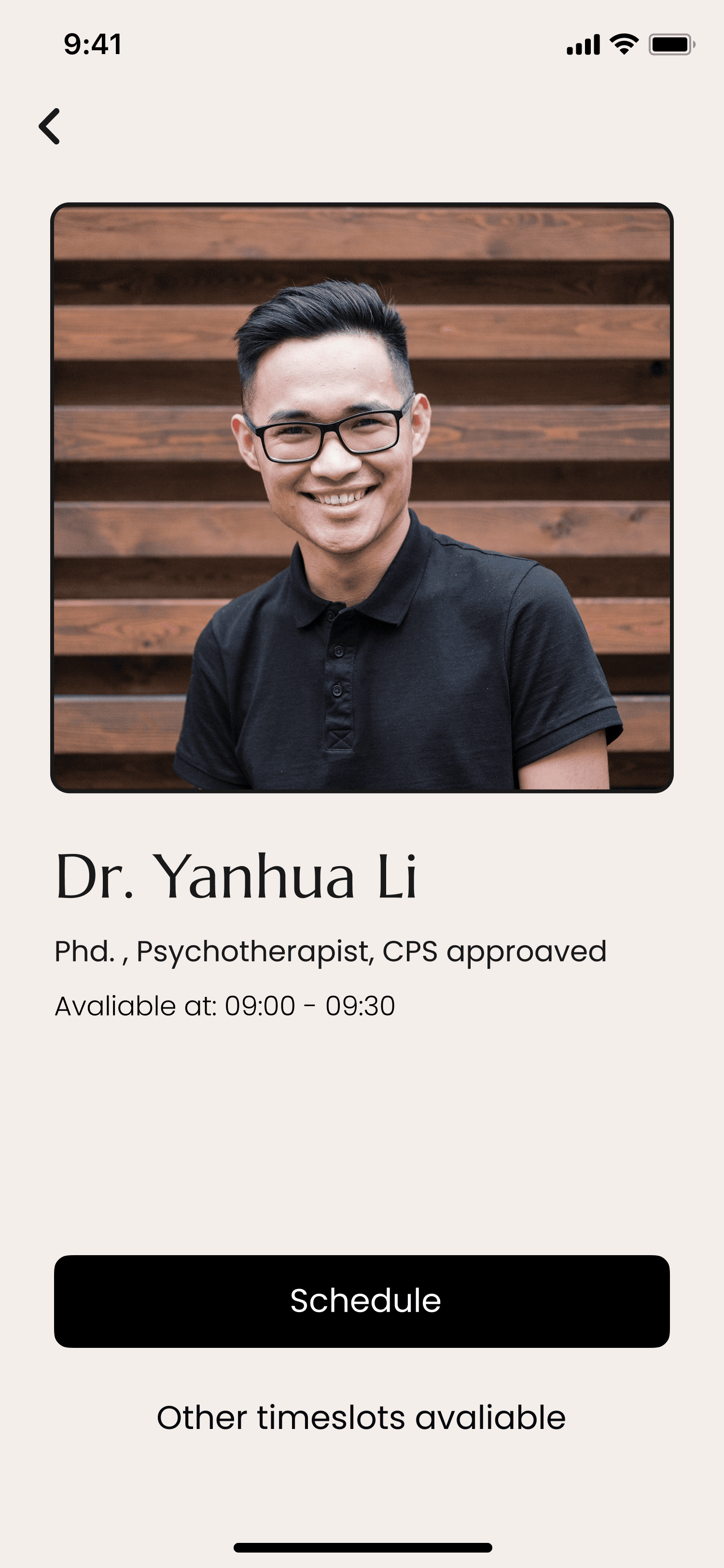
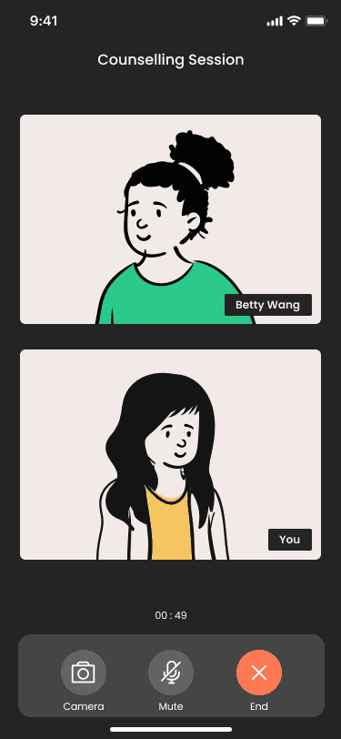
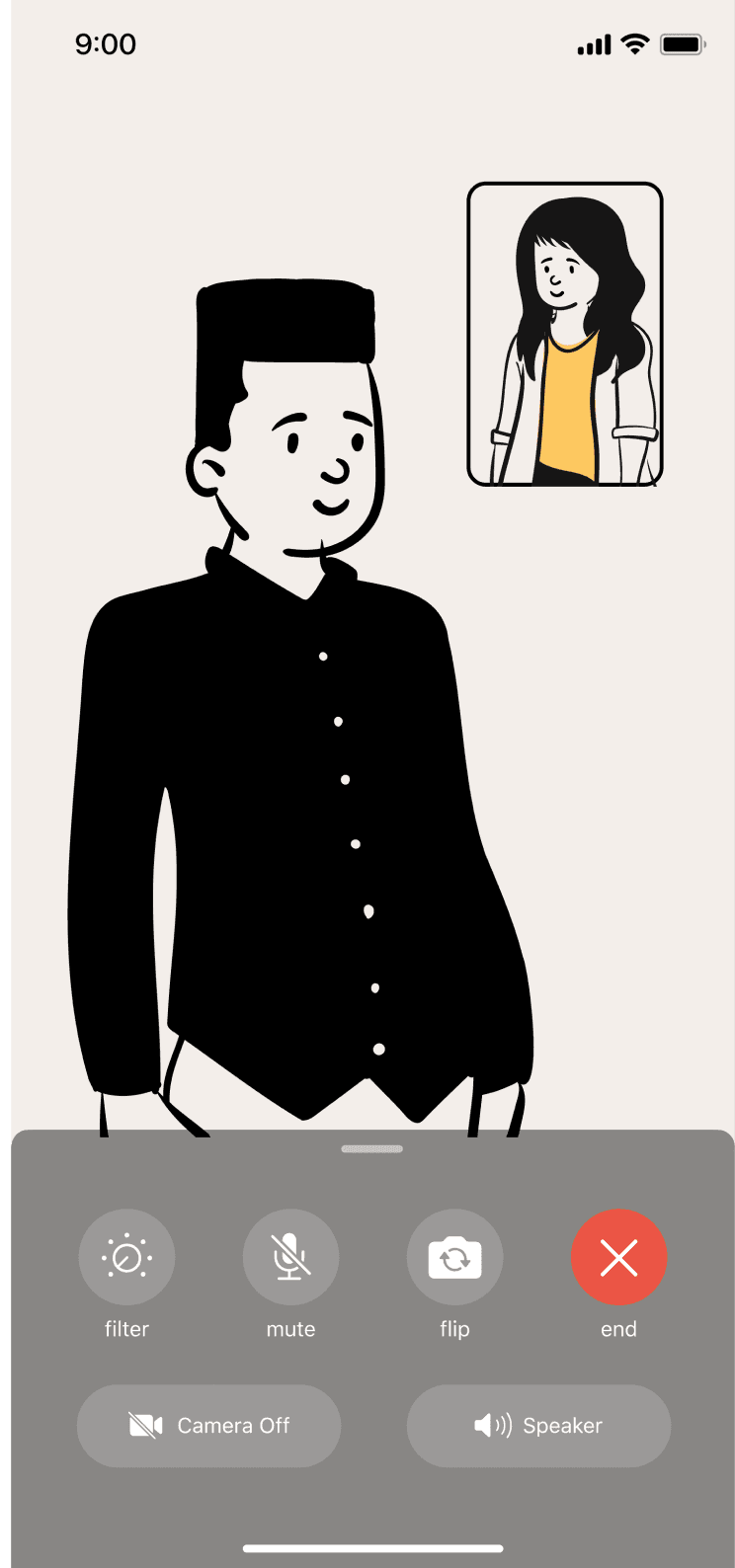
For example, the A/B testing allows us to validate which counselling call design should we use, with or without avatar mask for the therapist.

For example, the A/B testing allows us to validate which counselling call design should we use, with or without avatar mask for the therapist.

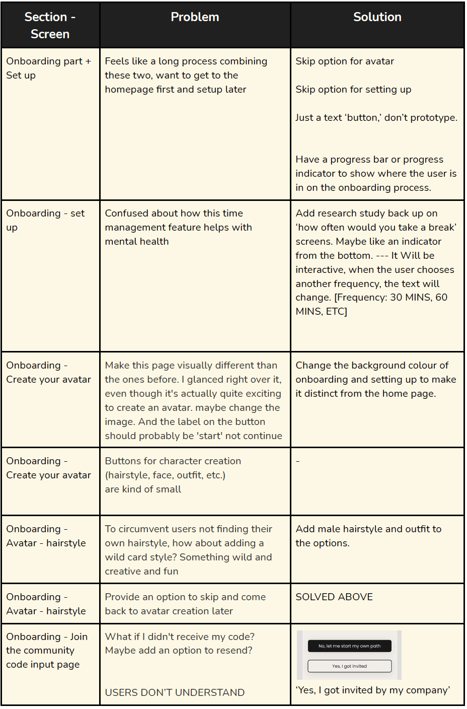
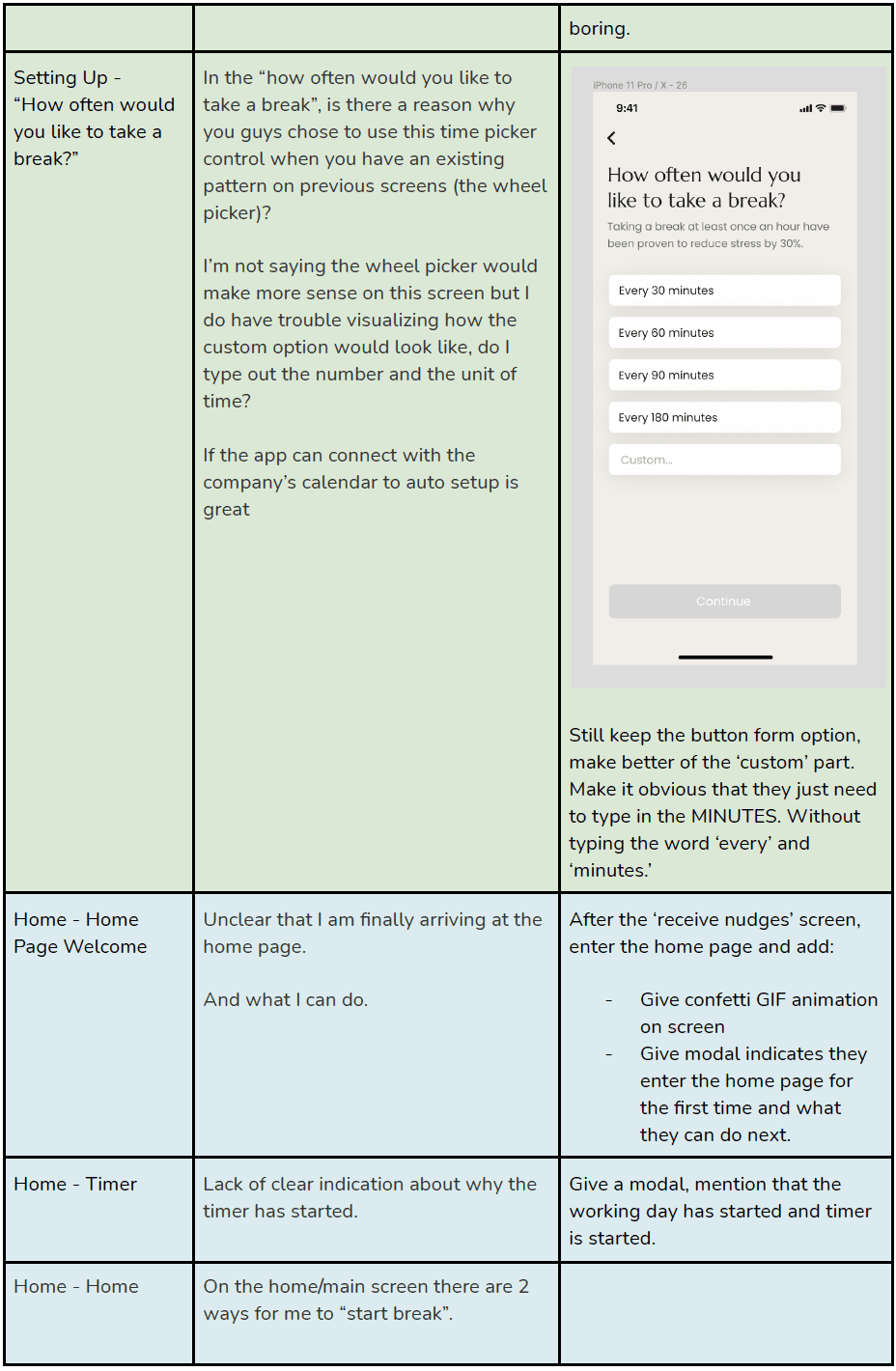
Feedback Log

Feedback Log

All feedback in one document to input, prioritize improvements and track progresses.

UX Design

We also log all feedback in one document so we can easily track all input, prioritize improvements and track progresses.

We also log all feedback in one document so we can easily track all input, prioritize improvements and track progresses.

We also log all feedback in one document so we can easily track all input, prioritize improvements and track progresses.

Iteration #1

Iteration #1

UX Design

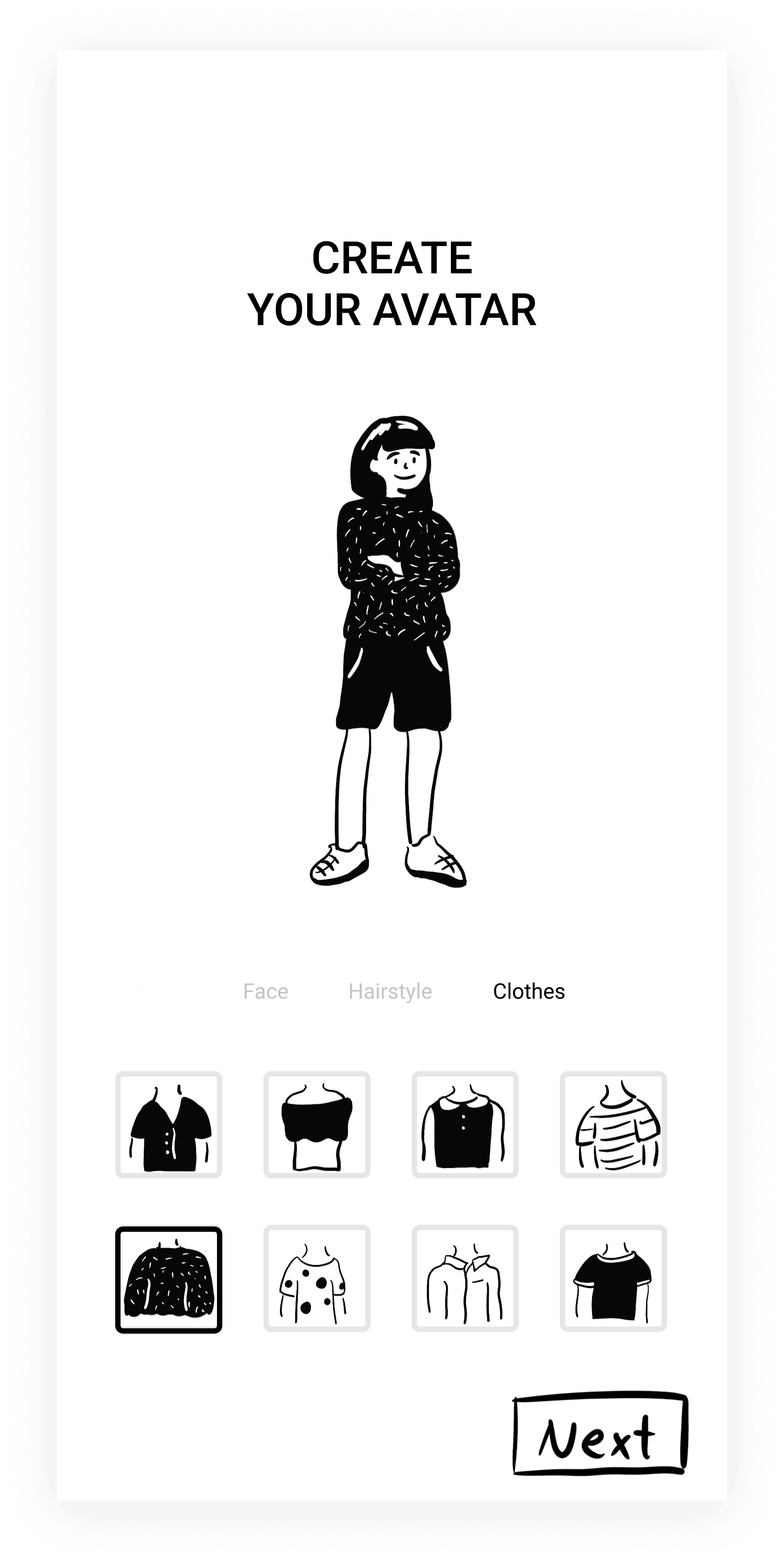
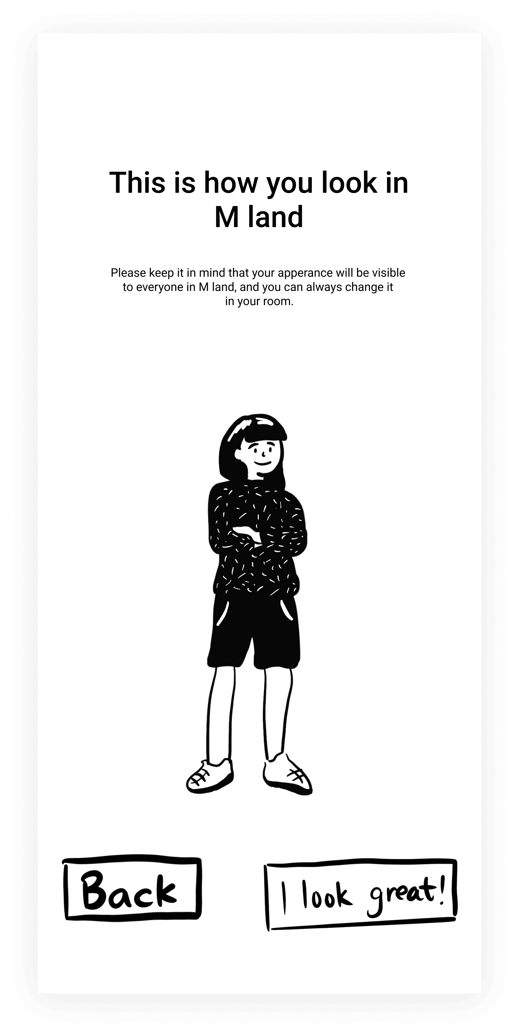
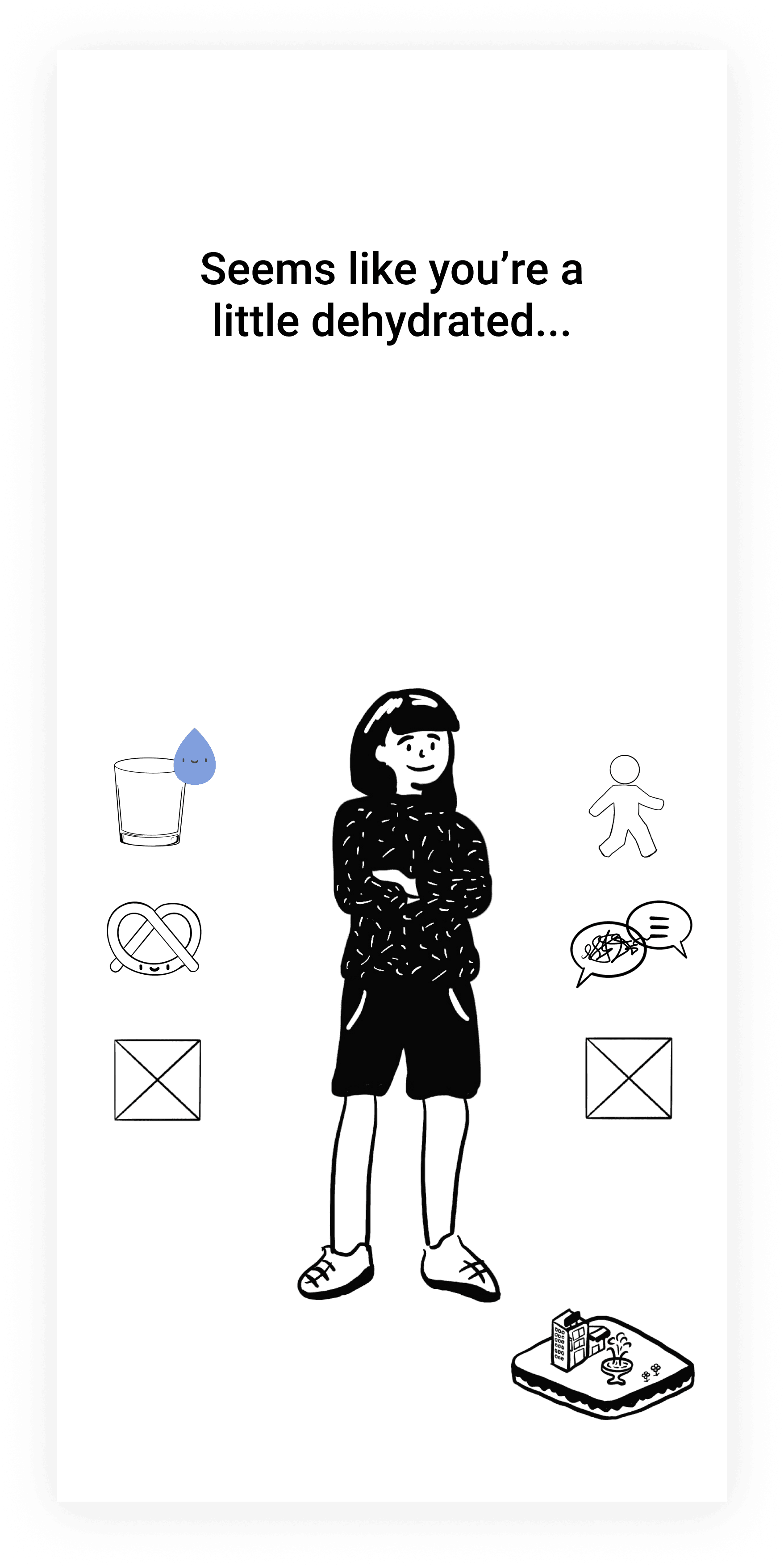
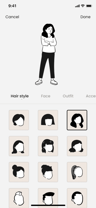
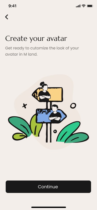
Focus on the Avatar feature, but users couldn’t see the whole idea of our product.

Focus on the Avatar feature, but users couldn’t see the whole idea of our product.

Iteration #2+3

Iteration #2+3

UX Design

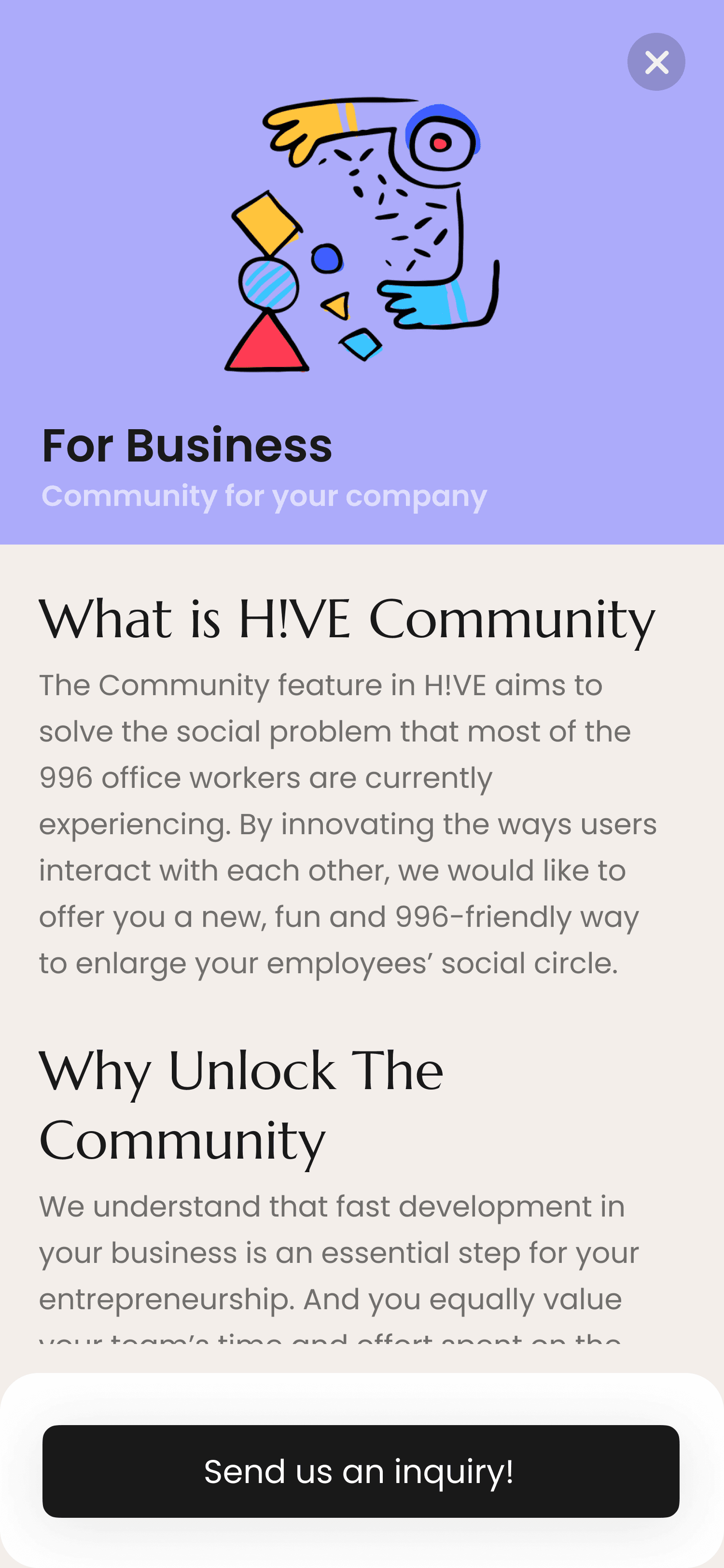
Covered all 3 main sections in the app. But disconnection among the 3 parts.

Covered all 3 main sections in the app. But disconnection among the 3 parts.

Covered all 2 main sections in the app. But disconnection among the 2 parts.

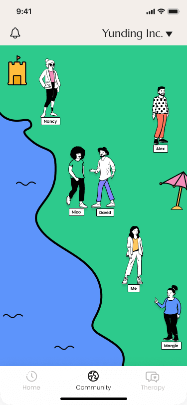
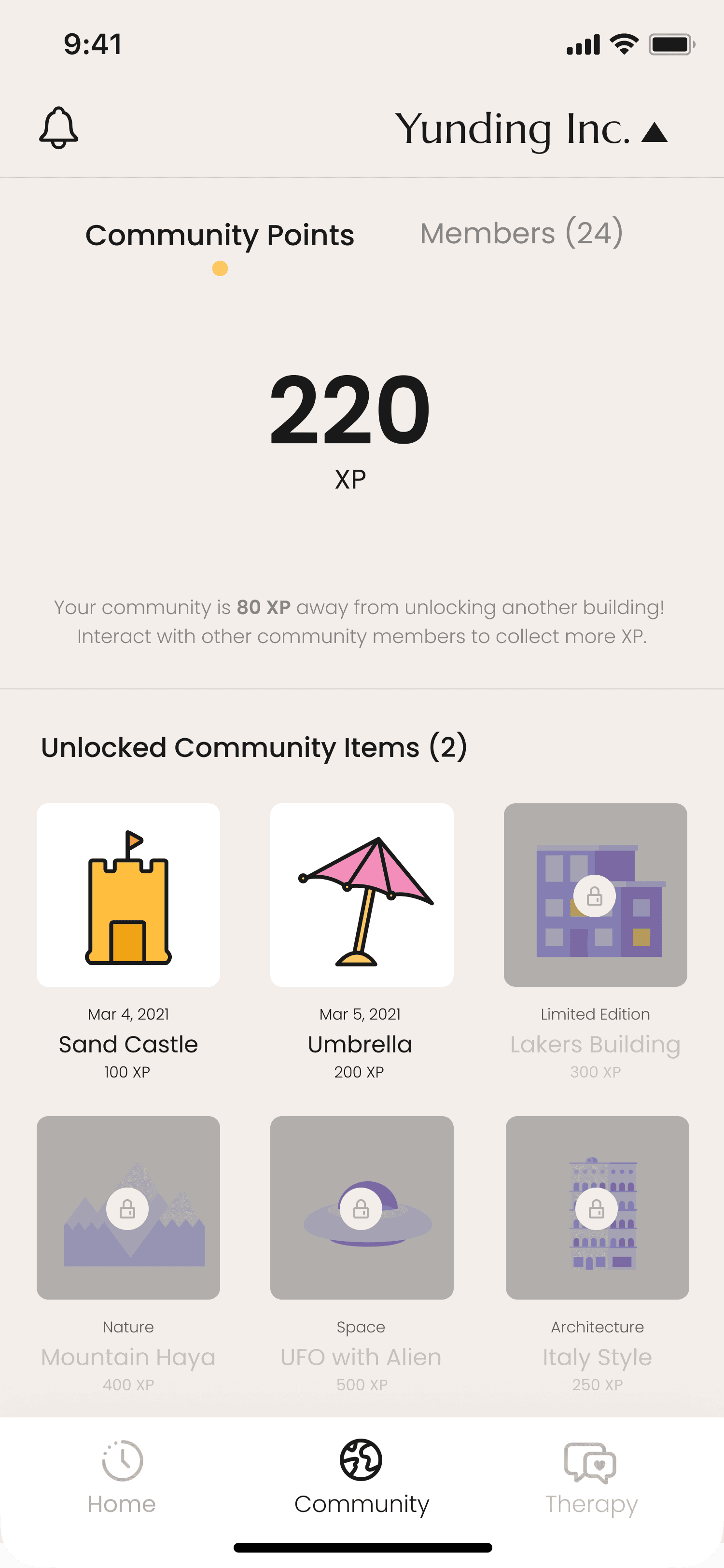
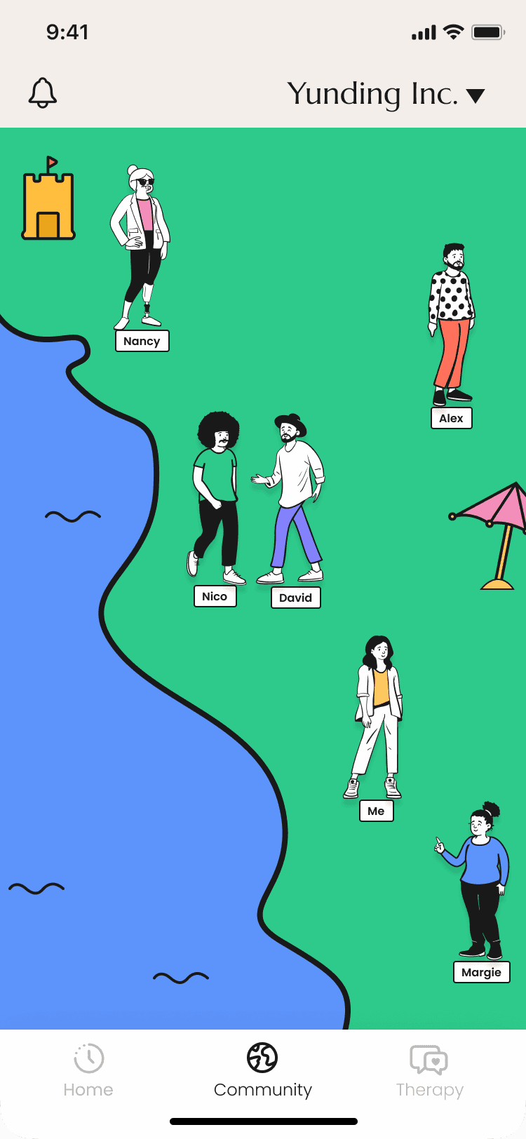
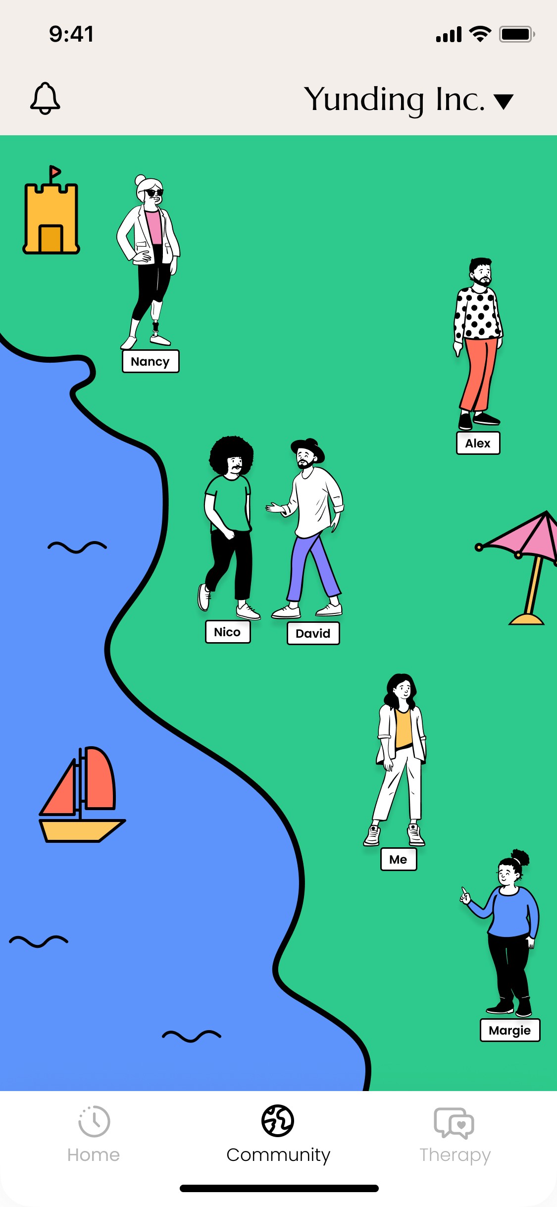
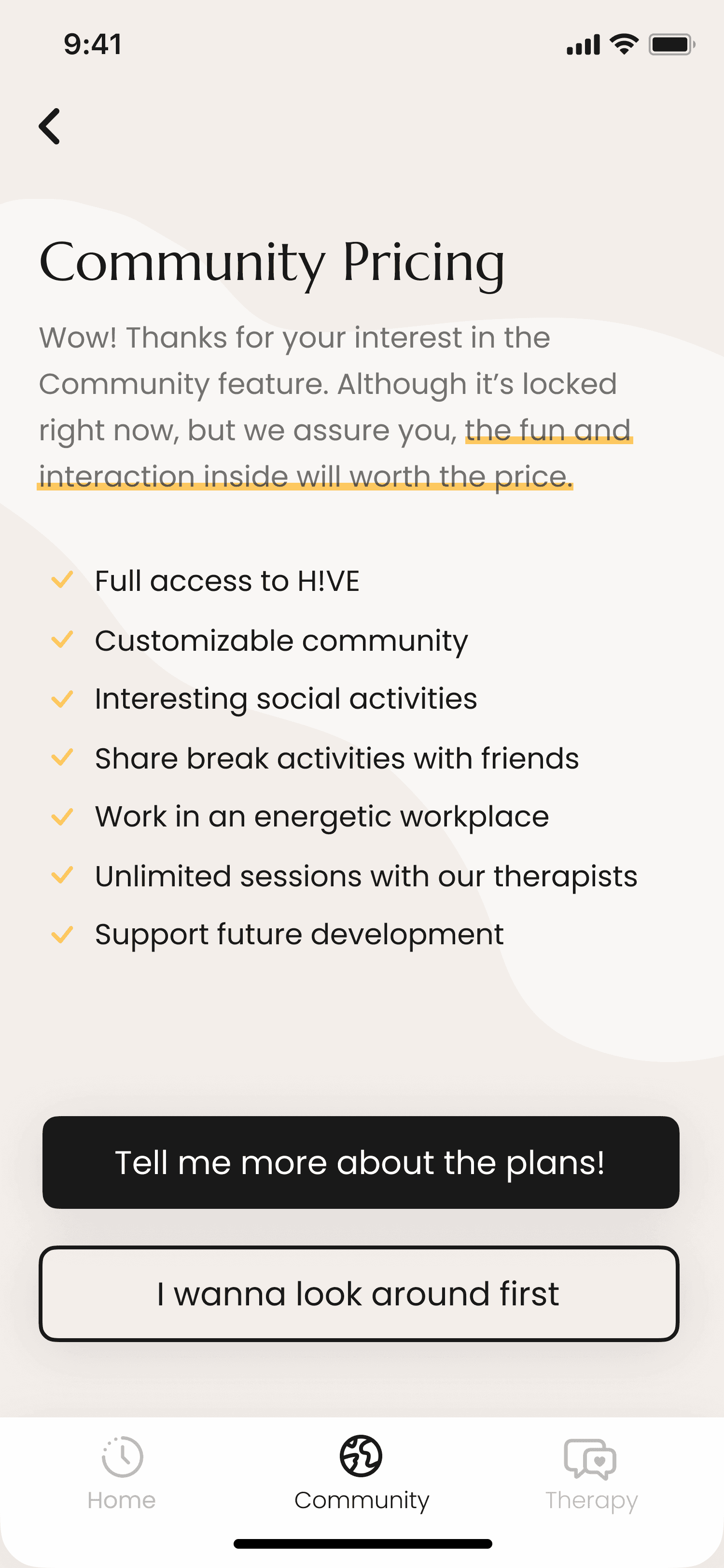
Community

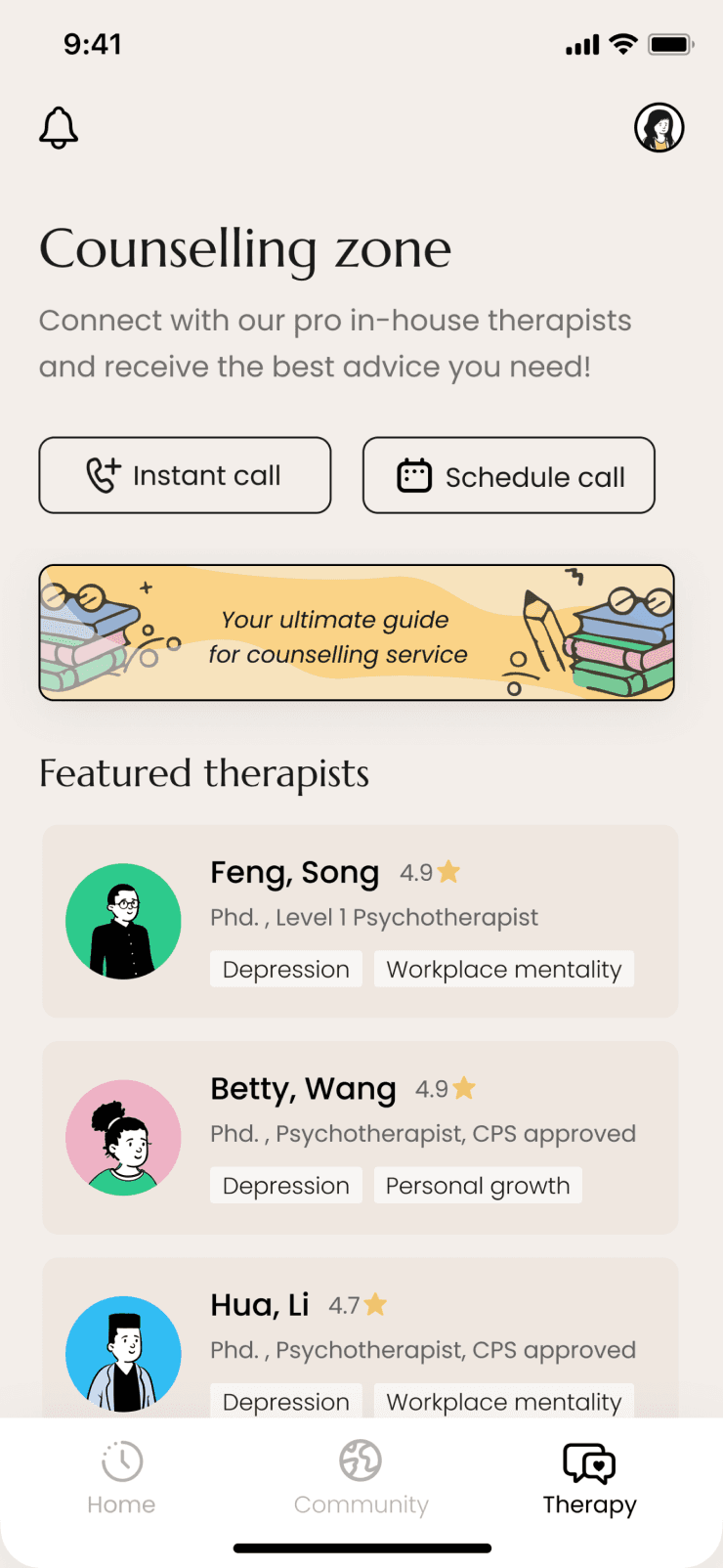
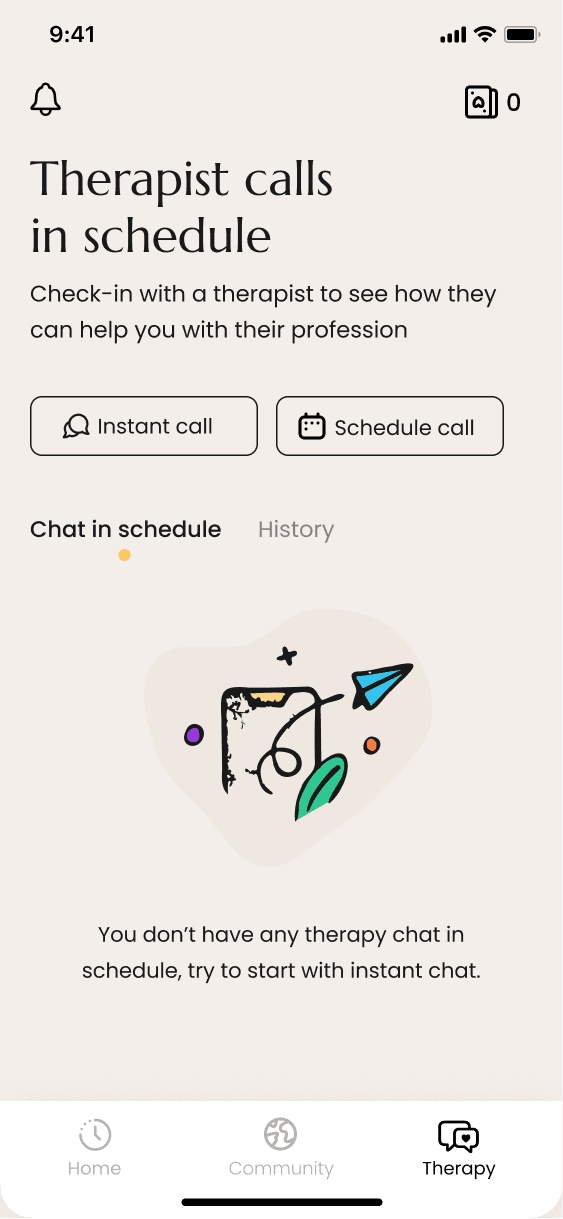
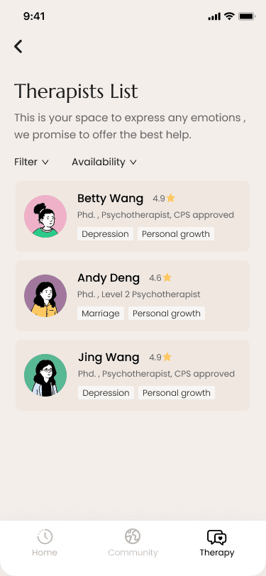
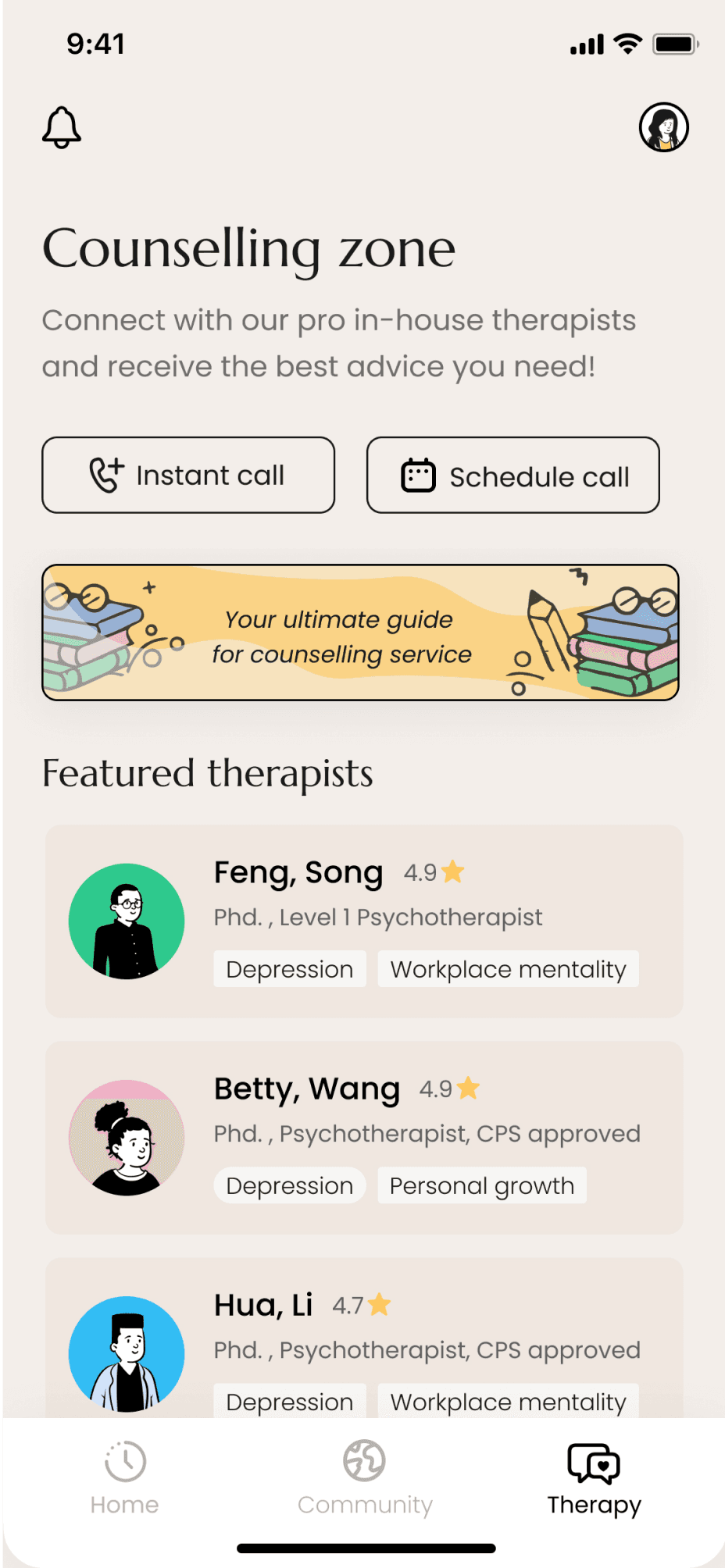
Counselling

In iteration 2


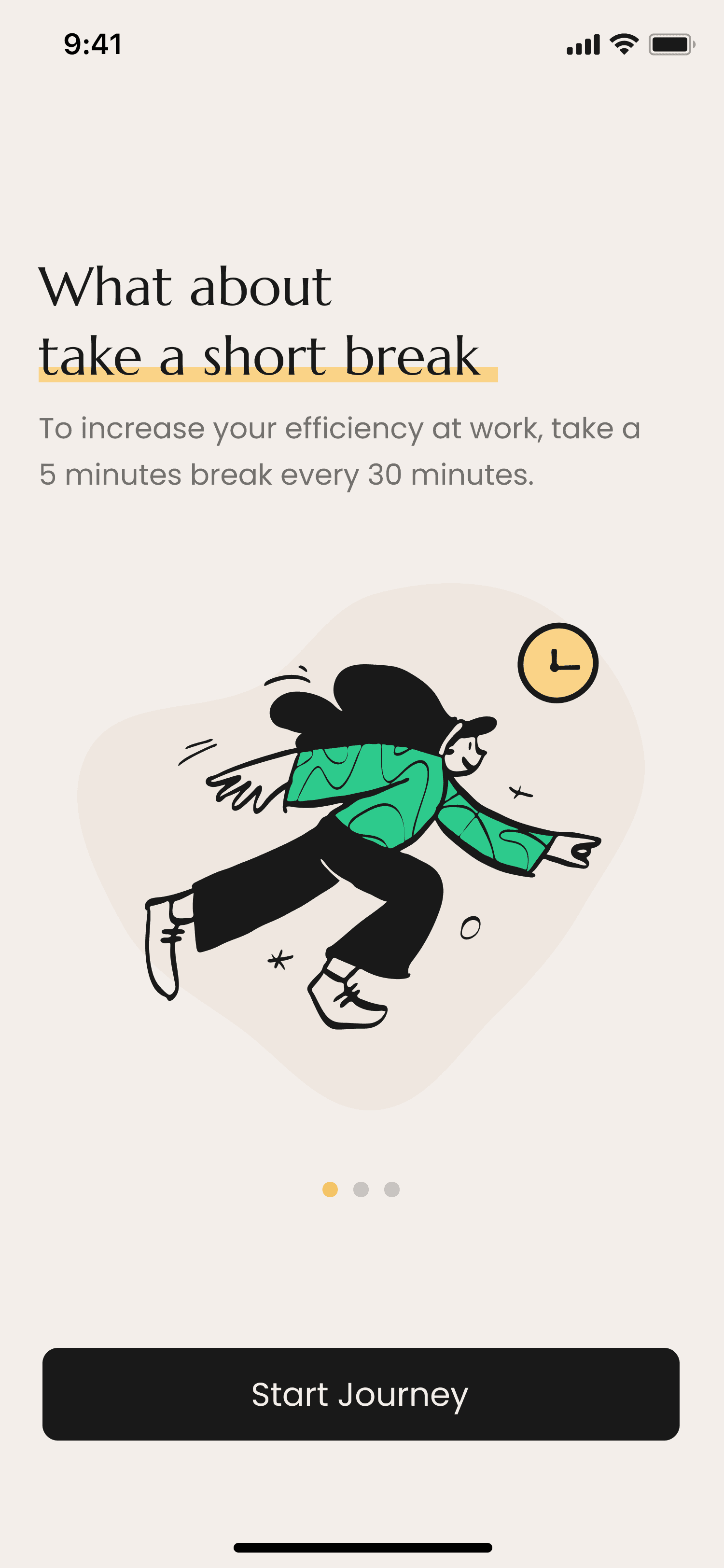
We started to flush out all parts of the app including the 2 main pillars: break reminders, community, counselling.


Usability test participants were able to navigate through the prototype and understand that all actions of the 3 main features can help to better their mental health, wellbeing and productivity.


In iteration 2


Usability test participants were able to navigate through the prototype and understand that all actions of the 2 main features can help to better their mental health, wellbeing and productivity.


In iteration 3


We continued based on the previous iteration and created stronger connections between the 2 main pillars.

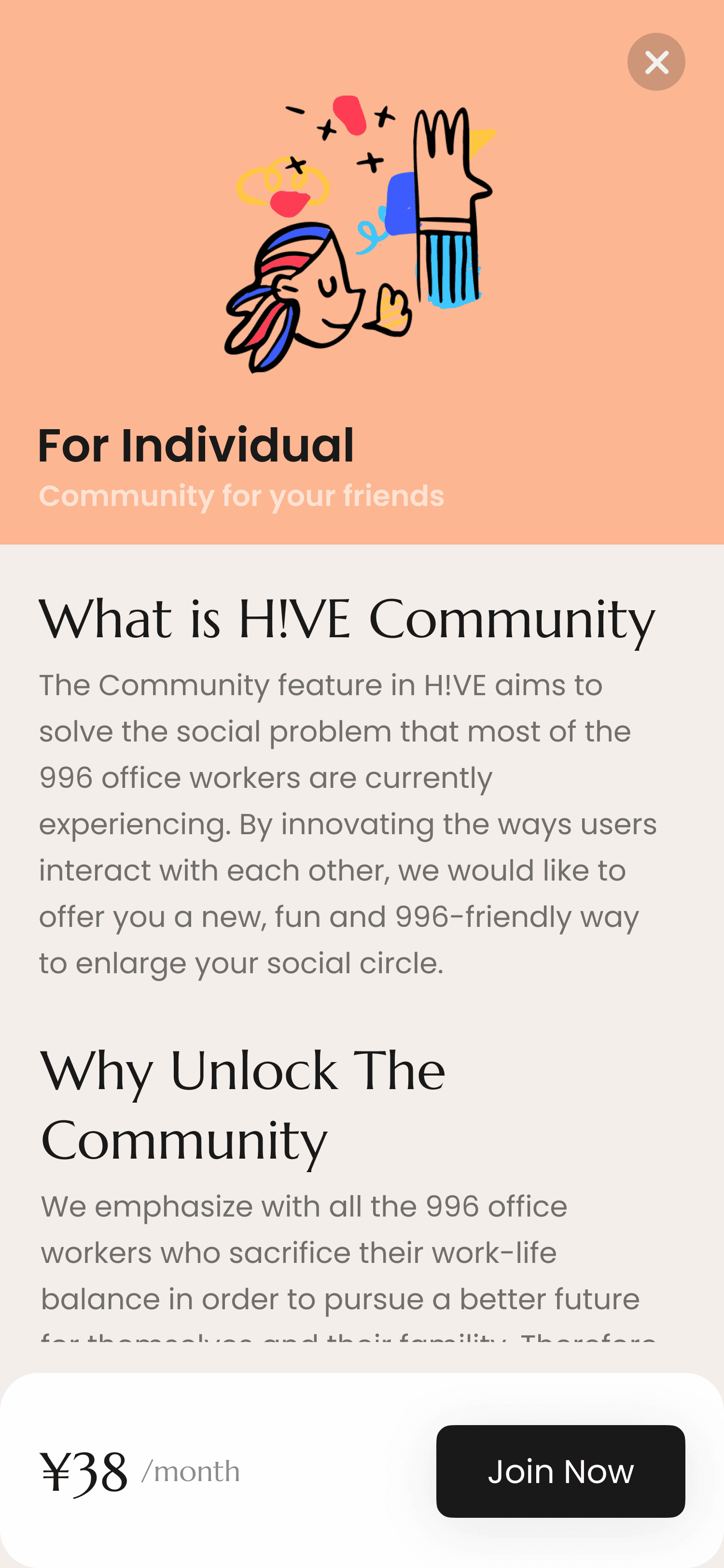
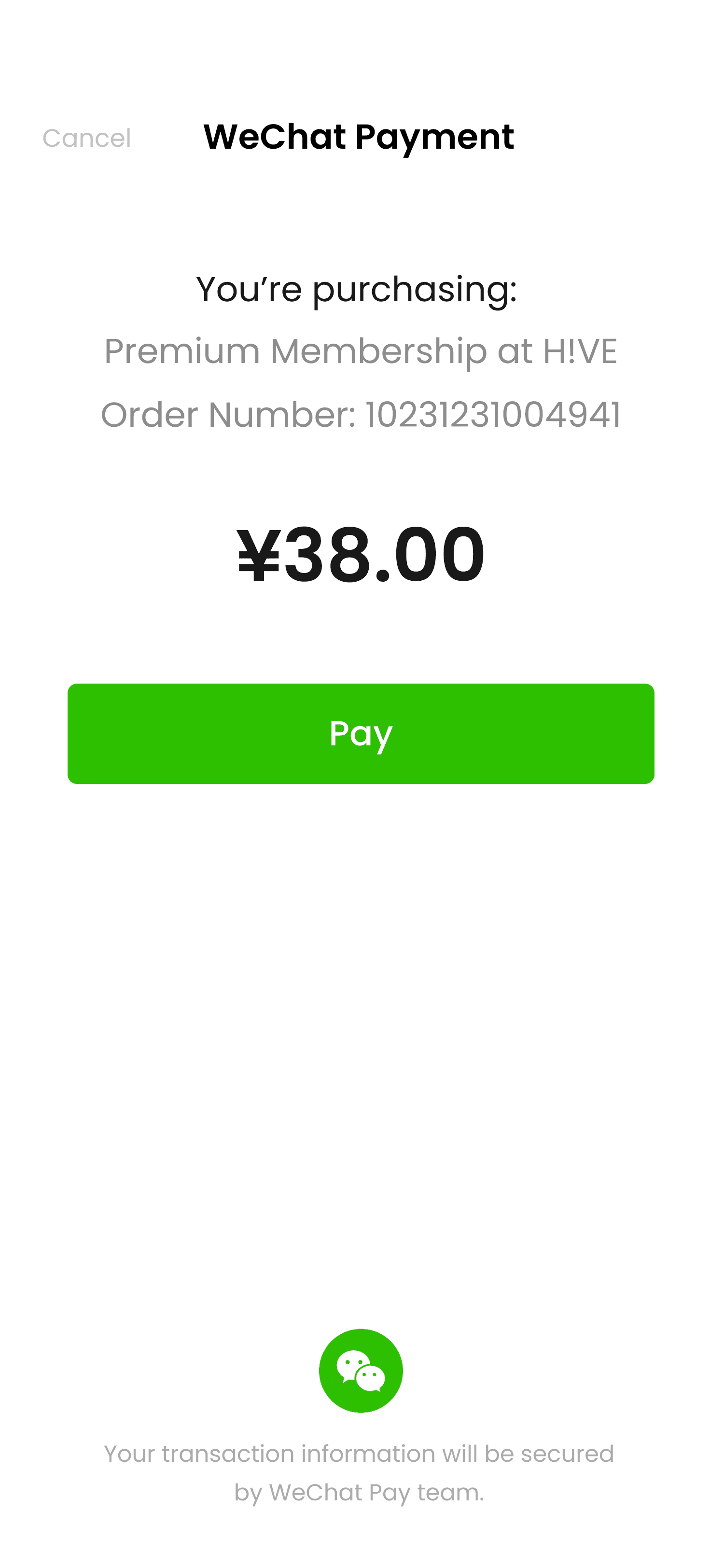
We aim to emphasize the mental health part by adding more user-centred service design as the final polish. Also, we added a membership feature to prove our business model.

Vivid colours | Refreshing | Classic but modern
Design evaluate

Design Reviews

KEEP:
80% of the users suggested they find the services we provided useful.

90% of the young workers (22-28) suggested They would likely use our services and they loved the design (colour/ tone) of this App.

CHANGE:

55% of the users think the membership feature should not exist since they prefer more accessible services

Overeall, our users believe this would be good platform, but we should introduce more services if we want to use premium/ freemium model in the future.

Back to HOME

Design evaluate

Vivid colours | Refreshing | Classic but modern
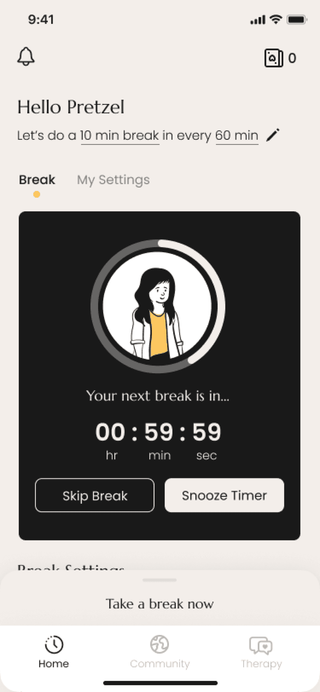
Design Reviews

KEEP:
80% of the users suggested they find the services we provided useful.

90% of the young workers (22-28) suggested They would likely use our services and they loved the design (colour/ tone) of this App.

CHANGE:

55% of the users think the membership feature should not exist since they prefer more accessible services

Overeall, our users believe this would be good platform, but we should introduce more services if we want to use premium/ freemium model in the future.

Back to HOME